
![]()
![]()
![]()
![]()
![]()
![]()
![]()
![]()
![]()

Corporate Identity usually consists of a (hopefully) rememberable logotype and other related materials, such as business cards, nameplates for web-pages and newsletters, letterheads, envelopes and so on.
![]()
Valiant is an Amazone sports equipment store, for which I designed a logo and all the other advertisement pieces.
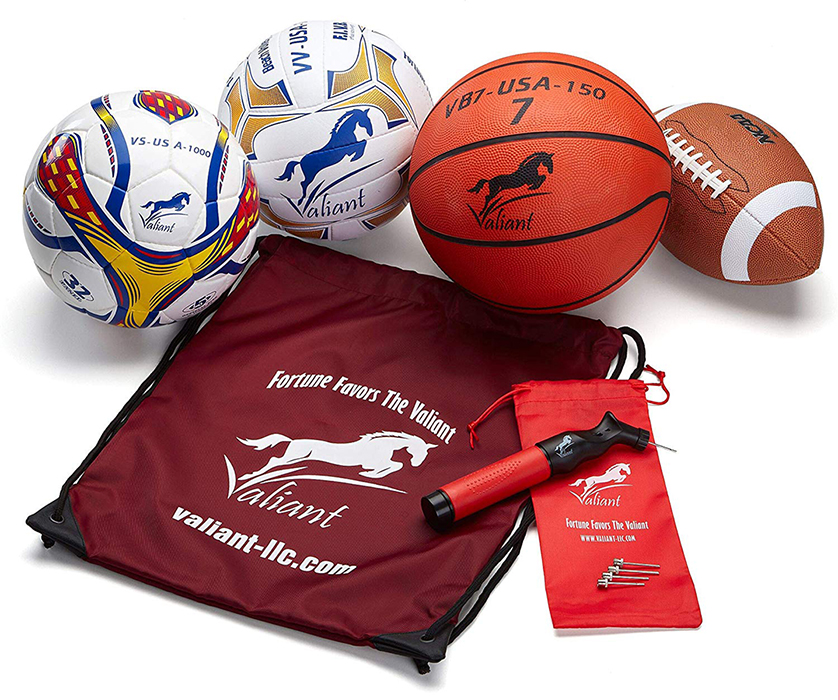
Check the store to see more.
![]()
![]()

![]()
![]()
![]()

![]()
Managed Analytic Services and Digital Legacy Institution
![]()
![]()
![]()
See more KittyPrivy pieces I designed on
my Advertisement page
KittyPrivy is a revolutionary kitty litter container and filter system, which is discreet, attractive and odour-free.


Annelaine Productions is an association producing music specifically for ballet excersizes, so the logo conveys the close connection between music and dance (and the slogan "Dance and music indivisible").

Zaccheo & Associates is a small, responsive, professional firm of seasoned executives and chartered accountants.

![]() Hudson's
Bay Company has its own Information Services division, which has its
own club, which has its own logo.
Hudson's
Bay Company has its own Information Services division, which has its
own club, which has its own logo.
![]()
![]()

Nameplate and business card for Konik Computer Services; it is a small Toronto-based company, and its name and logo clearly reflect what it does.
![]()
![]()
Top Gastro Europe is a German company that inspects and rates restaurants in the European Union. The German part of the logo says: Your Restaurant Guide — Culinary Recommendations for your trip. The logo has a very "upscale" look (choice of fonts, horisontal composition), and the golden parts of the grape leaf make it slightly more playful.
![]()
![]()

Imago is
an artistic photography studio in Belgium (Kunst Fotografie in Dutch),
specializing in private photos of women, which is why the first letter
"I" is shaped like a nude female figure. (Please remember
that European, and especially Belgian and Dutch attitude towards nudity
is very different from that in North America.)
![]()
resume |
identity |
layout | ads | illustration | retouching | painting
various |
philosophy | personal